Challenge & Goal
CHALLENGE
Moveax wanted to enter an underserved segment between traditional car sharing and premium rental experiences. Existing competitors optimised for availability and low friction, but rarely delivered a premium digital experience that justified higher hourly pricing. The product needed to answer one question:
How do we make users comfortable paying premium pricing for a shared vehicle experience?
Success depended on reducing uncertainty during discovery, increasing booking confidence, and creating a perception of quality across every interaction.
GOAL
✓ Increase first-booking conversion
✓ Reduce abandonment during car selection
✓ Create a differentiated premium positioning
✓ Support multi-city EU expansion
✓ Establish scalable UX foundations
Design Process
Understanding trust in premium mobility
I began by identifying what makes users hesitate when booking a premium shared vehicle. Through competitor analysis, behavioural review, and user conversations, I mapped the moments where confidence typically breaks down: account creation, vehicle evaluation, pricing comprehension, and payment. What emerged was not a usability problem but a perception problem.
Users associated premium services with operational reliability. Missing information, visual inconsistency, or unclear pricing were interpreted as signals of lower service quality. This insight became the foundation for the entire product strategy: every screen had to actively reinforce trust.
Translating research into experience principle
Rather than jumping directly into flows and wireframes, I translated insights into a set of experience principles that would guide every design decision.
Premium means less effort, not more features
The interface should reduce decision-making, not increase perceived sophistication through complexity.
Speed should never compromise confidence
Fast discovery matters, but users still need enough information to commit to higher-value bookings. These principles became decision criteria throughout the project.
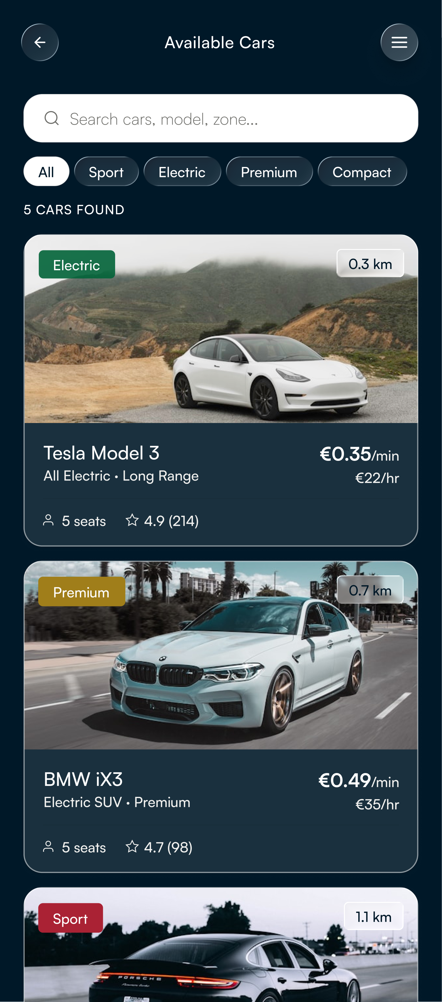
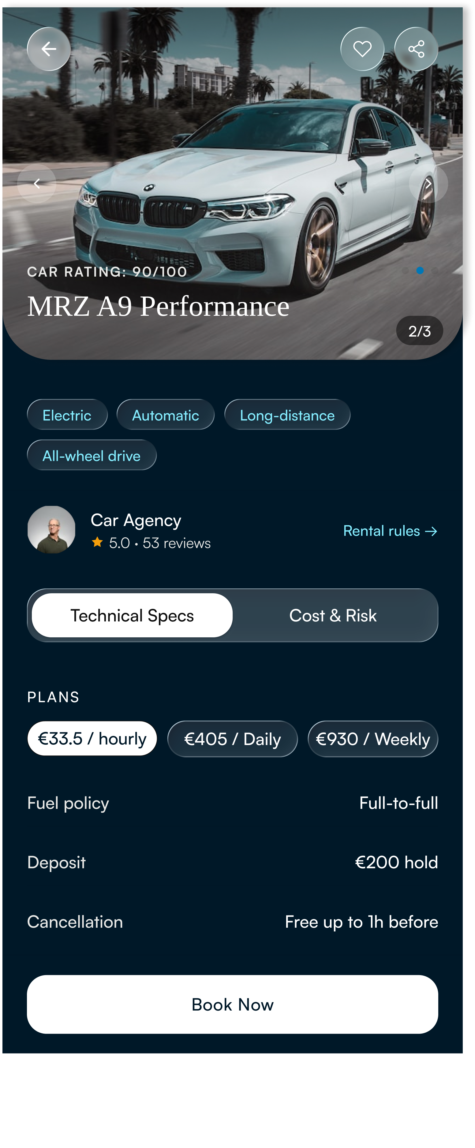
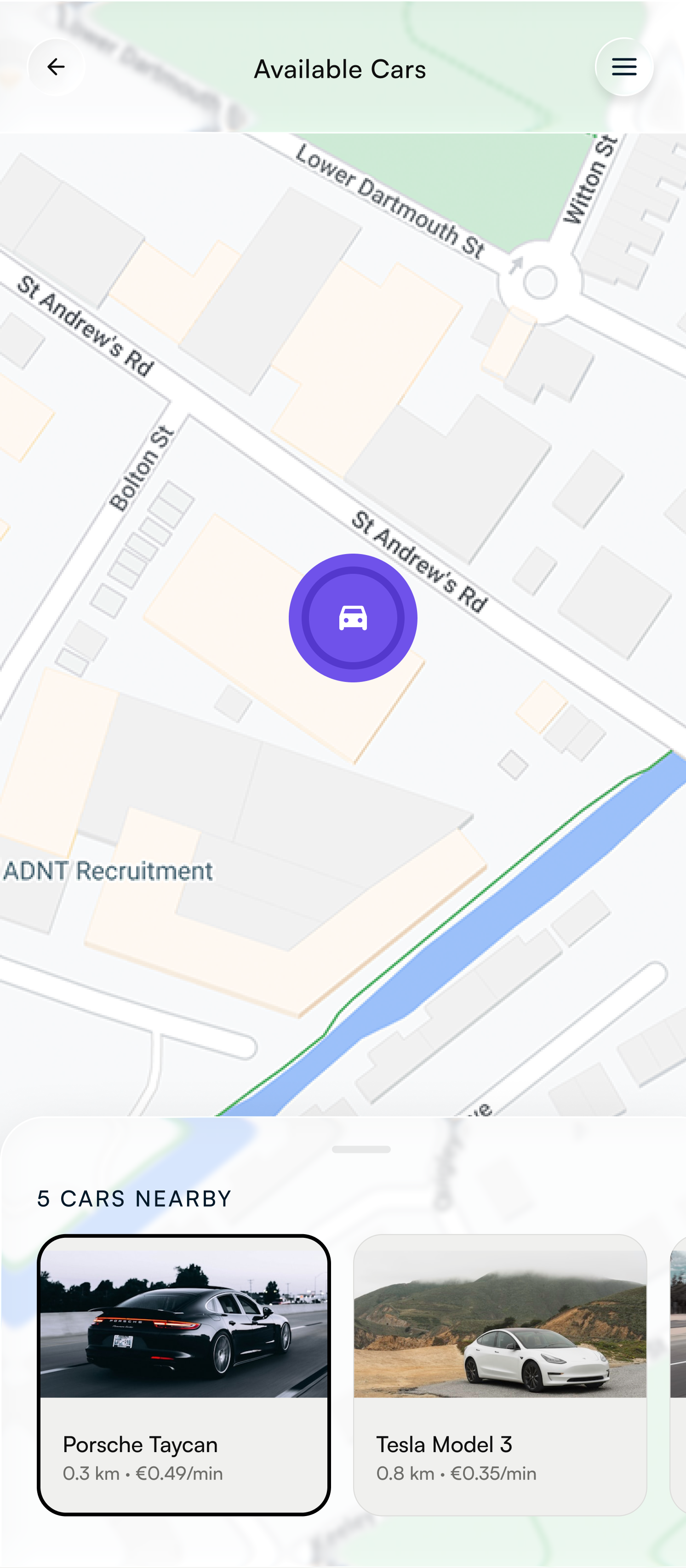
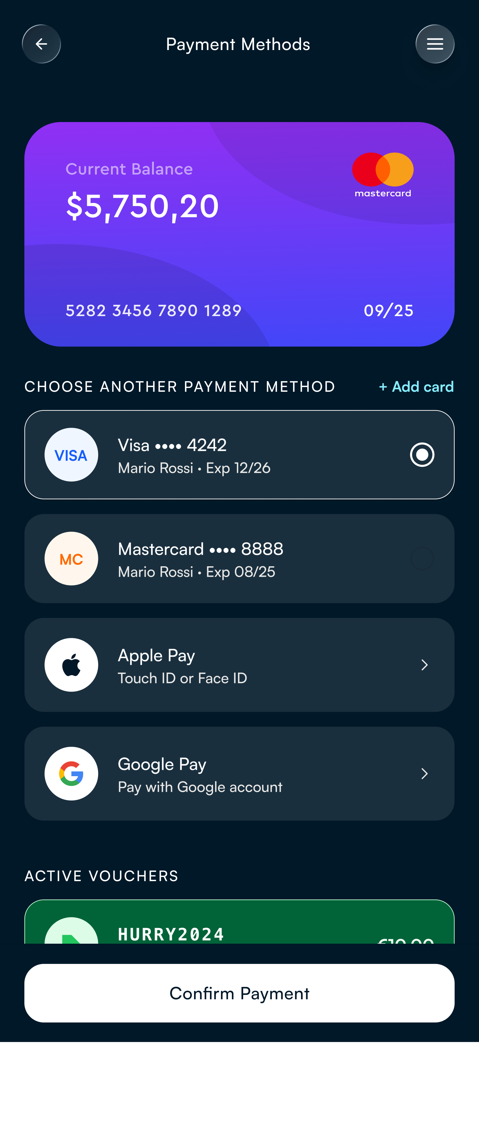
Designing the booking journey
With the principles defined, I designed the architecture around the critical conversion path:
Onboarding → Discovery → Vehicle validation → Payment → Booking
The objective was to progressively increase commitment while progressively reducing perceived risk.
Validating and identifying opportunities
Prototype testing focused on confidence, speed, and completion rather than aesthetic preference. Users successfully understood discovery options and navigated payment flows with minimal support. Testing also revealed opportunities that would shape a future iteration:
introduce an active-trip experience
close the loop after payment with confirmation states
strengthen empty-state scenarios
improve data consistency across pricing
The final result is not a finished product but a validated foundation for a premium mobility experience that balances aspiration with usability.
Reflection
This project reinforced a shift in how I approach premium digital experiences. Initially, I focused on creating a premium feeling through visual quality. Through research and iteration, I realised users associate premium less with aesthetics and more with confidence, clarity, and consistency.
The most valuable learning was understanding that trust should appear where uncertainty appears, not as a separate feature, but embedded into the journey. If I evolved the product further, I would prioritise post-booking experiences: active trip management, confirmation states, and retention mechanisms to extend the sense of quality beyond conversion. This project strengthened my approach to product design: designing not only for interaction quality, but for user confidence across the entire experience.